The promise of a shortcut
“Just install it.”
The team installs a tool and considers accessibility resolved, without investigating the product's barriers.
não acredite em ferramentas milagrosas: Do not believe in miracle tools

Accessibility has always been "left for later" because it has never been seen as a way to improve product quality, but as "something companies are required to include".
Using tools to fill gaps creates a false sense of compliance, while the actual experience remains compromised.
Scroll down to understand the differences between the paths chosen...
Follow the paths and reflect...


Two hands in black and white offer a red pill and a blue pill, referencing the film The Matrix. In the animated version, the hands turn over and the pills fall as you scroll.
Two choices. Different consequences.
Follow five stages of a digital product. On one side, accessibility as part of the work. On the other, the expectation that an overlay will solve everything.
The promise
of a shortcut
Accessibility
in practice
The promise of a shortcut
The team installs a tool and considers accessibility resolved, without investigating the product's barriers.
Accessibility in practice
The team identifies barriers, sets priorities and takes responsibility for addressing them.
The promise of a shortcut
Design, content and development teams continue working without training. Decisions that create barriers keep being repeated.
Accessibility in practice
Teams receive training to recognize barriers and incorporate accessibility into everyday decisions.
The promise of a shortcut
The product reaches implementation without accessibility requirements. The expectation is that a layer added to the website will make up for what was left out.
Accessibility in practice
Requirements, behaviors and acceptance criteria are documented from the design stage and guide development.
The promise of a shortcut
The presence of the feature is treated as proof of accessibility, without checking whether people can complete tasks.
Accessibility in practice
QA participates from the start. Automated and manual tests, assistive technologies and participation by people with disabilities help identify barriers.
The promise of a shortcut
New pages and features are published without an accessibility review. Trust in the tool replaces ongoing product monitoring.
Accessibility in practice
The team follows up on reports, checks for regressions and updates components and documentation to sustain improvements.
A long road...
It is important to understand that building better products does not involve ready-made formulas,
but contexts of use...
Understand the tool
Some accessibility tools add a settings panel to the page. They are known as overlays: a layer of features over the website you are using.
Most of the added features already exist in operating systems and browsers.
Features, alternatives and limitations
Compare the features offered, the options already available on devices and the barriers that still require work on the website itself.
Compare feature by feature
Many tools present having a hundred features as a selling point. But how many of those features actually affect people's experience or need to be there?
The following table shows some features offered by overlay tools and compares them with features available in operating systems or browsers. Keep in mind that redundancy alone does not necessarily mean a better or worse experience; this is simply a comparison table.
20 of 20 features displayed.
| Feature offered | Alternative or responsibility | Limits of the comparison |
|---|---|---|
| Increase and decrease text size High redundancy | Alternative or responsibility Browser zoom; text size in Windows, macOS, iOS and Android | Limits of the comparison Page zoom and text size have different effects. Support for adjustments varies between websites and apps. |
| Screen magnifier High redundancy | Alternative or responsibility Windows Magnifier, macOS and iOS Zoom, Android magnification | Limits of the comparison System magnification can cover the entire screen; a magnifier inside a website has limited reach. |
| Larger cursor High redundancy | Alternative or responsibility Pointer settings in Windows and macOS | Limits of the comparison System settings apply to other apps. Website-customized pointers may behave differently. |
| Change cursor color High redundancy | Alternative or responsibility Pointer customization in the operating system | Limits of the comparison Available options depend on the system and its version. |
| High contrast Significant redundancy | Alternative or responsibility Windows contrast themes; contrast options in macOS and iOS | Limits of the comparison Contrast themes, increased contrast and recoloring a page have different scopes. |
| Invert colors High redundancy | Alternative or responsibility Color inversion in macOS, iOS and Android | Limits of the comparison The treatment of images, videos and interface elements may vary. Inverting colors does not guarantee adequate contrast. |
| Grayscale High redundancy | Alternative or responsibility Operating system color filters | Limits of the comparison Removing colors does not resolve information that relies solely on color to be understood. |
| Color blindness filters Significant redundancy | Alternative or responsibility Color filters in Windows, macOS, iOS and Android | Limits of the comparison Filters and their results vary. Content still needs identification methods beyond color. |
| Dark mode Significant redundancy | Alternative or responsibility Appearance preferences in operating systems and browsers | Limits of the comparison A dark system or browser appearance does not automatically transform every website. The result depends on the page's support. |
| Read text aloud High redundancy | Alternative or responsibility System speech features, read-aloud features and reading modes | Limits of the comparison Listening to text is not equivalent to navigating and operating an interface with a screen reader. Available voices and languages vary. |
| Screen reader Specialized free alternative | Alternative or responsibility VoiceOver, NVDA, Jaws, TalkBack, Narrator, among others. | Limits of the comparison Screen readers provide navigation and interaction as well as speech. The website needs compatible semantics and behaviors. |
| Sign language avatar Specialized free alternative |
Alternative or responsibility
Avatars may be considered useful in specific scenarios. Example: VLibras (for Brazilian Sign Language) (opens in a new tab)open_in_new |
Limits of the comparison Sign language avatars can help some members of the Deaf community, and their features can be used independently of other tools with some usefulness in certain scenarios. However, prefer solutions that prioritize human interpreters. |
| Voice commands Significant redundancy | Alternative or responsibility Windows Voice Access, Apple Voice Control and Android Voice Access | Limits of the comparison Availability depends on the system, version and language. Commands limited to a website are not equivalent to controlling the device. |
| On-screen keyboard High redundancy | Alternative or responsibility On-screen keyboards are available in operating system settings | Limits of the comparison The keyboard enables data entry but does not fix components that cannot be reached or operated properly. |
| Reduce animations Partial redundancy | Alternative or responsibility Operating system reduced-motion preferences | Limits of the comparison The preference does not guarantee that all movement on a page stops. The website needs to respect it and provide suitable controls. |
| Simplified reading mode Significant redundancy | Alternative or responsibility Reading modes in browsers and Android | Limits of the comparison Not all pages are compatible. A simplified presentation does not replace operating forms and other components. |
| Reading mask Partial redundancy | Alternative or responsibility Line focus features in browser reading modes | Limits of the comparison The mask visually reduces the content around a reading band. Availability of the alternative depends on reading mode; the feature does not fix content structure and must allow adjustment and disabling. |
| Reading guide Partial redundancy | Alternative or responsibility Line tracking features in browser reading modes | Limits of the comparison A ruler or visual line helps mark the reading position. It is not necessarily equivalent to line focus in a reading mode or to keyboard focus; it must not obscure content or prevent interactions. |
| More readable font Partial redundancy | Alternative or responsibility Font customization in the browser and some reading modes | Limits of the comparison Font application varies between pages and reading modes. No single font meets everyone's needs. |
| Eye or facial tracking Partial redundancy | Alternative or responsibility Windows eye control and facial-expression controls in compatible systems | Limits of the comparison Eye control and facial control are distinct features. They may require specific hardware and depend on the device and its version. Note: It is important to know whether screen recordings are being stored, due to requirements related to LGPD, GDPR, CCPA or equivalent laws. |
The features in this table are not exhaustive and are intended only as an initial comparison.
| Feature offered | Synonyms and similar feature names | Documentation and free extensions |
|---|---|---|
| Increase and decrease text size | Synonyms and similar feature names Font size; text size; page zoom |
Documentation and free extensions
|
| Screen magnifier | Synonyms and similar feature names Magnifier; magnification; screen zoom |
Documentation and free extensions
|
| Larger cursor | Synonyms and similar feature names Enlarged pointer; pointer size; large cursor | Documentation and free extensions |
| Change cursor color | Synonyms and similar feature names Pointer color; custom pointer | Documentation and free extensions |
| High contrast | Synonyms and similar feature names Contrast themes; increase contrast; high contrast |
Documentation and free extensions
|
| Invert colors | Synonyms and similar feature names Color inversion; inverted colors; invert colors | Documentation and free extensions |
| Grayscale | Synonyms and similar feature names Grayscale; monochrome filter | Documentation and free extensions |
| Color blindness filters | Synonyms and similar feature names Color filters; color correction | Documentation and free extensions |
| Dark mode | Synonyms and similar feature names Dark theme; dark appearance; dark mode |
Documentation and free extensions
|
| Read text aloud | Synonyms and similar feature names Read aloud; speech synthesis; text-to-speech (TTS) |
Documentation and free extensions
|
| Screen reader | Synonyms and similar feature names Screen reader; screen reading; Narrator |
Documentation and free extensions
|
| Sign language avatar | Synonyms and similar feature names Libras avatar; automatic sign language translation; VLibras | Documentation and free extensions |
| Voice commands | Synonyms and similar feature names Voice access; voice control; voice commands |
Documentation and free extensions
|
| On-screen keyboard | Synonyms and similar feature names On-screen keyboard; accessibility keyboard |
Documentation and free extensions
|
| Reduce animations | Synonyms and similar feature names Reduce motion; animation effects; reduced motion | Documentation and free extensions |
| Simplified reading mode | Synonyms and similar feature names Reading mode; reader view; immersive reader; reader mode |
Documentation and free extensions
|
| Reading mask | Synonyms and similar feature names Screen mask; reading window; line focus; reading mask | Documentation and free extensions |
| Reading guide | Synonyms and similar feature names Reading ruler; line guide; reading guide | Documentation and free extensions |
| More readable font | Synonyms and similar feature names Customize fonts; font family; font style |
Documentation and free extensions
|
| Eye or facial tracking | Synonyms and similar feature names Eye control; head pointer; eye tracking; head tracking | Documentation and free extensions |
These names help you search for similar features, but do not imply equivalence in every context. Availability depends on the system, version and content; some links are in English.
Behavioral analysis
The name says it: FUNCTIONALITY. Does this function actually help?
| Feature | Key question |
|---|---|
| Keyboard navigation | Key question Why should it be necessary to enable a feature to operate something that should work naturally with a keyboard? |
| Screen reader compatibility | Key question Why was the website not developed to work correctly with the screen readers people already use? |
| Automatic image descriptions | Key question How can you ensure that an automatically generated description accurately represents the purpose of the image? |
| Highlighting links and headings | Key question If elements cannot be identified, why not fix their presentation and semantics in the original interface? |
| Disability profiles | Key question Why assume that people with the same disability need the same adjustments? |
| Text spacing adjustment | Key question If someone changes the spacing, does the layout remain functional without loss of content? |
| Enlarging text and content | Key question When content is enlarged, can the person still read, access controls and complete their task without overlap or loss of information? |
| High contrast and color inversion | Key question Does the adjustment preserve the identification of fields, error messages, focus and control states, or improve one part of the page while making another harder to use? |
| Color filters and grayscale | Key question If information relies solely on color, does the filter resolve that barrier, or are text, symbols and other ways to identify it still missing? |
| Read text aloud | Key question Does reading aloud help people understand the content, and can it be paused and stopped without competing with the screen reader or other sounds the person already uses? |
| Animation reduction | Key question When movement stops, do carousels, menus and other components remain operable? Why not respect the system preference from the start? |
| Simplified reading mode | Key question Does simplification preserve essential information, reading order and necessary links, or remove parts the person needs? |
| Voice commands | Key question Can the person activate controls using the names shown on screen, without having to learn commands unique to this tool? |
| Changing fonts | Key question Does changing the font respect the person's preference and preserve the readability of all characters, without clipping text or disrupting components? |
Consider the effort
It is not uncommon to hear claims that the number of options offered is a positive factor for accessibility. But quantity will never be a measure of quality, especially when we consider various studies linking the number of options to increased cognitive load, such as this 2023 study (opens in a new tab)open_in_new, for example.
A possible sequence of attention, interpretation and decision-making when using a preferences panel:
Select a step to explore an example. Select it again to collapse it.
Example situation
You are filling out a form and need larger text. Before continuing, you look for the button that opens the preferences panel.
Example situation
The panel offers “Contrast”, “Saturation” and “Highlight”. You read the labels and try to work out which option will make the text easier to read.
Example situation
You compare increasing the font size, zooming in on the page and changing the spacing to decide which option to try first.
Example situation
You increase the text size, return to the form and check whether it is easier to read. If it does not help, you return to the panel to try another setting.
Example situation
After closing the panel, you look for the field you were working on and recall the information you intended to enter.
Learn from good ideas
Developing products and services also involves recognizing and using good practices. Just as some good practices from major companies are adopted, also adopt their approach of developing products consistently by training their teams.
Joint statement by the European Disability Forum (EDF) and the International Association of Accessibility Professionals (IAAP) on accessibility overlays.
Read the joint statement (opens in a new tab) open_in_new
The European Disability Forum, users with disabilities and many accessibility experts have expressed concerns about the use of overlays.
Read the position (opens in a new tab) open_in_new
The DoIT Office of Information Accessibility currently advises against including overlays on state websites.
Read the guidance (opens in a new tab) open_in_new
There are many more references to explore. Scroll a little further for a list.
For deeper study
The following links include research, companies sued despite using tools, personal accounts, detailed analyses and information that can inform arguments and decisions about different types of tools.
Some open-source options for your projects
Based on the same options available in operating systems and browsers, we built a free, open-source ADJUSTMENT tool that you can freely use, recreate and adapt in your projects.
Just remember that it should be described as an ADJUSTMENT tool, not as an accessibility solution.
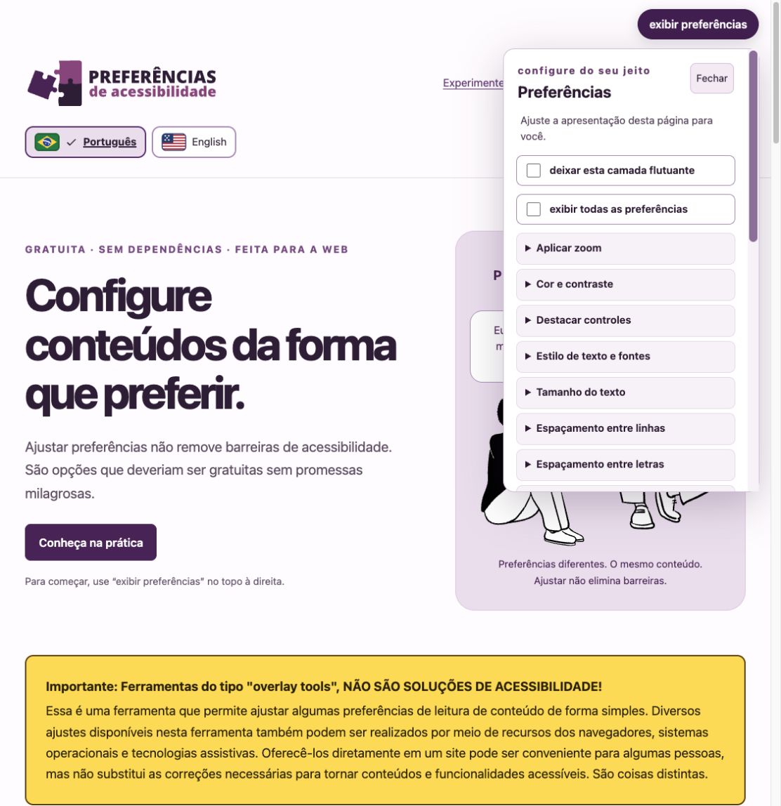
Explore Preferências de Acessibilidade (opens in a new tab) open_in_new
When unchecked, the tool will be hidden and adjustments will be reset.
We do not endorse the use of tools, but there are reasons why some people may want to use them.
Just remember that offering adjustment tools is different from making digital products or services accessible.